Why Branding Design Matters More Than a Logo for Delhi Businesses
Most Delhi business owners think branding is done once a logo is finalized. It isn’t. A logo is one visual mark; branding is the entire system — colors, typography, tone, imagery, and consistency — that decides whether a customer remembers you or scrolls past you. If you’ve spent money on a logo and still feel like your business “doesn’t look serious enough” next to competitors, the logo was never the problem.
What Branding Design Actually Covers
A logo answers one question: what’s your mark? Branding design answers a much bigger one: how does your business look, sound, and feel everywhere a customer sees it — your Instagram grid, your invoice, your shop signage, your website, your WhatsApp business catalog.
That system includes:
- Brand identity design — the full visual language: primary and secondary colors, font pairing, logo variations, spacing rules, imagery style
- Visual branding strategy — how that identity gets applied consistently across every touchpoint, and why certain choices were made for your specific audience
- Brand recall triggers — the repeated visual cues (a specific shade of blue, a distinctive icon style, a consistent tone in captions) that make people recognize you before they even read your name
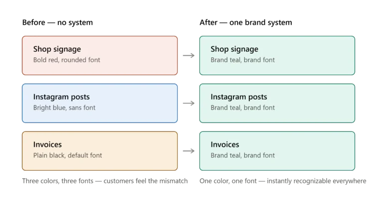
A business with a decent logo but no system behind it usually looks like three different companies depending on where you find them — one look on the shop board, another on Instagram, a third on the website. That inconsistency is quietly expensive.
Why This Matters More in a Market Like Delhi
Delhi’s business density means customers are comparing you against five other options within a two-minute scroll or a five-minute walk. In markets like Karol Bagh, Lajpat Nagar, or Nehru Place, where similar shops sit next to each other, visual distinction often decides who gets the first message, not just quality or pricing. A brand that looks put-together signals reliability before a single word is exchanged — that’s the entire job of design in a crowded market.
Color Psychology: More Than a Style Choice
Color isn’t decoration; it’s information. A financial consultant using bright pink signals the wrong thing before a client reads a single line of copy. A children’s brand using dark corporate navy feels cold and mismatched. Color choices should map to what the business actually does and who it’s talking to:
- Blues and greens tend to read as trustworthy — common in finance, healthcare, education
- Warm tones (orange, red, mustard) read as energetic and approachable — common in food, retail, local services
- Neutral palettes with a single accent color read as premium — common in consulting, real estate, high-ticket services
The mistake most small businesses make isn’t picking a “bad” color — it’s picking a color with no reasoning behind it, then changing it every few months because nothing feels consistent.
Typography Is Doing More Work Than You Think
Fonts carry tone the same way color does. A rounded, playful font on a legal consultancy’s signage creates a subtle mismatch a customer feels even if they can’t name it. Typography decisions — which font for headlines, which for body text, how much spacing, how bold — need to match what the brand is trying to say about itself: serious, friendly, premium, fast, traditional.
Most businesses use whatever font came default in Canva or whatever their previous designer picked without explanation. That’s not a strategy; it’s a guess.
Brand Consistency: The Part Everyone Skips
This is where branding usually breaks down. A business gets a logo, uses it correctly on the website, then the person managing Instagram picks a different font for reels, the printer uses a slightly different shade of the brand color for visiting cards, and within six months there’s no single consistent look left. Customers don’t consciously notice this — but they feel it as a lack of professionalism, even when they can’t explain why.
Consistency isn’t about being rigid. It’s about having clear guidelines — exact color codes, approved font files, logo usage rules — so anyone touching your brand (an intern, a printer, a freelancer) produces something that still looks like you.
Common Mistakes Delhi Businesses Make With Branding
- Treating the logo as the finish line instead of the starting point
- Changing colors or fonts every time a new person joins the marketing team
- Copying a competitor’s visual style instead of building one rooted in their own positioning
- Skipping a style guide entirely, so consistency depends on memory instead of documentation
- Investing heavily in the website’s design while ignoring how mismatched it looks against their offline signage or packaging
How This Connects to the Rest of Your Brand Strategy
Branding design isn’t a standalone task — it’s the foundation that a Graphic Designer & Branding Design Consultant works from before touching individual deliverables like social media creatives, packaging, or signage. Getting the identity system right first means every asset built afterward — from a website to a pamphlet — automatically looks like it belongs to the same business, instead of needing to be redesigned every time you add something new.
Is a logo redesign the same as branding?
No. A logo redesign changes one visual mark. Branding design builds the full system — color, typography, tone, application rules — that the logo sits inside.
How much does professional branding design cost in Delhi?
It depends on scope — whether you need a full identity system, brand guidelines document, or just specific assets. Get in touch directly to discuss what your business actually needs before committing to a package.
My business already has a logo — do I still need branding design?
Usually yes, if everything around the logo (colors on your signage, fonts in your posts, tone in your captions) hasn’t been built as one consistent system. The logo alone isn’t the brand.
How long does a full branding design project take?
This varies by scope and how many touchpoints need to be covered — ask directly for a timeline based on your specific business.
What's actually included in a brand identity design package?
Typically the logo and its variations, a defined color palette with exact codes, font pairing for headlines and body text, and rules for how these apply across signage, social media, packaging, and digital platforms. What’s included depends on the specific package agreed on.
Can I keep my current logo and just fix the inconsistency around it?
Yes. If the logo itself works but everything around it — colors, fonts, tone — doesn’t match, the fix is usually building the missing brand guidelines rather than redesigning the logo from scratch.
Do small or new businesses actually need branding design, or just a logo?
New businesses benefit even more, since early consistency is easier to build than fixing a scattered look later. A basic identity system from day one saves rework as the business grows.
How do I know if my current branding is hurting my business?
Common signs: customers confuse you with competitors, your online presence looks unrelated to your offline presence, or people can’t describe your brand in one sentence. These usually trace back to a missing or inconsistent visual system.
What happens after the branding design is finalized — do I get files I can reuse?
Yes, typically you’d receive the finished assets and guidelines needed to apply the brand consistently going forward — the specifics depend on what’s scoped in the project.
Does branding design also cover packaging and print materials, or just digital?
A proper branding system is built to apply everywhere — digital, print, signage, packaging — not just one platform. That’s the entire point of building the system before individual assets.