Signs Your Brand Identity Needs a Redesign
If your logo, colors, and messaging still look like they did five years ago while your business, your customers, and your competitors have all moved on — that gap is usually the clearest sign a brand identity redesign is overdue. Businesses rarely wake up one day and decide to rebrand; the need builds quietly through inconsistent visuals, a website that feels dated next to newer competitors, and a nagging sense that the brand no longer says what the company actually does.
What "Brand identity" actually covers
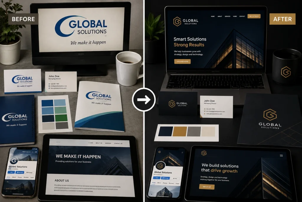
Before spotting the warning signs, it helps to be clear on what’s being evaluated. Brand identity isn’t just the logo — it’s the logo, color palette, typography, tone of voice, and the way all of it shows up consistently across a website, social pages, packaging, invoices, and signage. When even one of these pieces drifts out of sync with the rest, customers pick up on it, even if they can’t name exactly what feels off.
1. Your visuals don't match across platforms anymore
This is the most common and most fixable sign. One color scheme on the website, a slightly different one on Instagram, an old logo file still sitting on invoices or business cards — each inconsistency chips away at recognition. A customer should be able to tell it’s your business from a glance at any touchpoint, without reading the name. If they can’t, visual inconsistency has already become a real cost, not just a cosmetic issue.
2. The business has outgrown the original design
A logo designed for a small local service business doesn’t always hold up once that business is bidding for corporate clients, expanding to new cities, or adding services the original brand never accounted for. If your current identity was built around a version of the company that no longer exists — a different product line, a different scale, a different type of customer — the design is representing yesterday’s business, not today’s.
3. It looks like it was made years ago, because it was
Design trends move. A logo with heavy gradients, generic stock fonts, or clip-art style icons instantly signals “made a while back” to anyone paying attention — including potential clients quietly judging credibility before they’ve read a single word on your site. This isn’t about chasing every trend; it’s about avoiding a look that reads as outdated the moment someone scrolls past it.
4. Customers or new hires misread what you do
If people regularly ask “wait, so what exactly does your company do?” after seeing your branding, that’s a signal worth taking seriously. Strong brand identity should communicate the category and positioning almost instantly — through color, imagery style, and tone — before a single word of copy is read. Confusion at first glance usually means the visual language and the actual business have quietly stopped matching.
5. You're embarrassed to hand out your own materials
Founders and teams often notice this internally before customers ever say anything out loud — hesitating before sharing the website link, printing new business cards, or pitching a new client. That instinct is data. If the identity doesn’t feel like a fair representation of the quality of work being delivered, it’s actively working against the business rather than for it.
6. A merger, repositioning, or new market changes what the brand needs to say
Market repositioning — moving upmarket, adding a new service line, entering a new city, or shifting the target audience — usually requires the identity to shift with it. A brand built to look “affordable and approachable” sends the wrong signal the moment the business repositions toward premium, corporate, or enterprise clients. The visuals need to lead that shift, not lag behind it.
Brand refresh vs. rebrand: which one do you actually need?
This is where most businesses get stuck, so it’s worth separating clearly.
A brand refresh keeps the core identity — same name, same general recognition — but modernizes the execution: cleaner logo variant, updated color palette, consistent typography, refreshed website design. This fits situations where the brand still resonates but the delivery feels dated or inconsistent.
A full rebrand starts closer to scratch — new name, new logo, new positioning — and fits when the business has fundamentally changed direction, merged with another company, or when the existing brand carries real reputational baggage that a fresh coat of visuals can’t fix.
Most businesses showing the signs above need a refresh, not a full rebrand. Jumping straight to a rebrand when a refresh would solve the problem wastes budget and throws away recognition that’s actually still working in your favor.
Brand fatigue is a real signal, not just internal boredom
It’s worth separating genuine brand fatigue — customers, staff, and the market visibly disengaging or misreading the brand — from a founder simply getting tired of looking at the same logo every day. Internal boredom with a design isn’t, by itself, a reason to redesign; the signs listed above, backed by actual inconsistency or confusion customers are experiencing, are what justify the investment.
What a redesign process typically involves
A proper brand identity redesign isn’t just a new logo file. It usually works through: auditing the current identity and every place it appears, clarifying positioning and audience before any visual work starts, developing logo and color system options, building out typography and voice guidelines, and then rolling the new identity across the website, social presence, and physical materials in a planned sequence rather than all at once. Rushing straight to logo concepts without the positioning step is one of the most common reasons redesigns end up needing to be redone within a year.
If your business is also due for related work — a website that needs to reflect the new identity once it’s built — this ties directly into website development services, since a redesigned brand identity that isn’t carried through to the site defeats much of the purpose.
FAQs
How do I know if I need a refresh or a full rebrand?
If your business name, core audience, and overall positioning are still accurate and working, a refresh is almost always the right call. A full rebrand is for cases where the business itself has fundamentally changed — new ownership, merged entity, or a positioning shift so large the old name no longer fits.
How often should a brand identity actually be updated?
There’s no fixed timeline — some brands go a decade without needing a change, others need one within two years because of rapid growth. The signs above matter more than a calendar date.
Will a redesign confuse existing customers?
A refresh done well — keeping the name and core recognition elements while updating execution — rarely causes confusion. Full rebrands need a planned rollout and clear communication, but the risk is manageable when the transition is handled deliberately rather than switched overnight without notice.
What's the biggest mistake businesses make when redesigning their brand identity?
Starting with logo concepts before nailing down positioning. A new logo built on the same confused positioning as the old one just becomes a nicer-looking version of the same problem.
Can I redesign just the logo without touching the rest of the brand identity?
You can, but it usually creates a new inconsistency instead of fixing the old one — a modern logo sitting on top of dated typography, colors, or a website that hasn’t changed will still feel disjointed. It’s better to treat the logo as one piece of a coordinated update, even if the rollout happens in phases.
How long does a full brand identity redesign usually take?
It depends on scope, but a proper process — positioning review, concept development, revisions, and rollout across touchpoints — typically isn’t a quick turnaround. Rushing this timeline is usually what leads to a redesign needing to be redone again within a year or two.
Does a small business really need a formal brand identity, or is that only for big companies?
Small and local businesses arguably need it more, since inconsistent or dated branding is often the first thing that makes a smaller company look less credible next to bigger competitors. A clear, consistent identity is one of the more affordable ways to close that credibility gap.
What happens to my old branding once a redesign is done — do I need to replace everything at once?
Not necessarily. Digital touchpoints like the website and social profiles are usually updated first since they’re highest-visibility, while physical materials like signage, packaging, or printed stock can transition as existing inventory runs out, as long as there’s a clear plan and timeline for the full switch.
Can a redesign hurt my SEO or search rankings?
It can, if it’s handled carelessly — for example, changing the website’s structure, URLs, or content without proper redirects. Done correctly, updating the visual identity and even the website design shouldn’t disrupt rankings, but any technical changes during the rollout need to be planned with SEO in mind, not treated as an afterthought.
How do I convince my team or business partners that a redesign is actually necessary?
Point to specific, observable signs rather than personal preference — inconsistent visuals across platforms, direct customer confusion about what the business does, or losing pitches to competitors with a stronger visual presence. Concrete examples land better internally than “I think it looks old.
Thinking about a redesign?
If any of the signs above sound familiar, it’s worth a conversation before committing budget to a full redesign versus a targeted refresh. Reach out to Sanjeev Kumar Malik at 9718604362, or take a look at the branding and website work here to see what a properly aligned identity and site look like together.