Must-Have Features for a High-Converting Ecommerce Website
A product catalog alone doesn’t sell anything — conversion comes from how easy you make it for a visitor to find what they want, trust your store, and complete checkout without friction. Most ecommerce sites lose sales not because the product is wrong, but because the site experience gets in the way. Here’s what actually moves the needle.
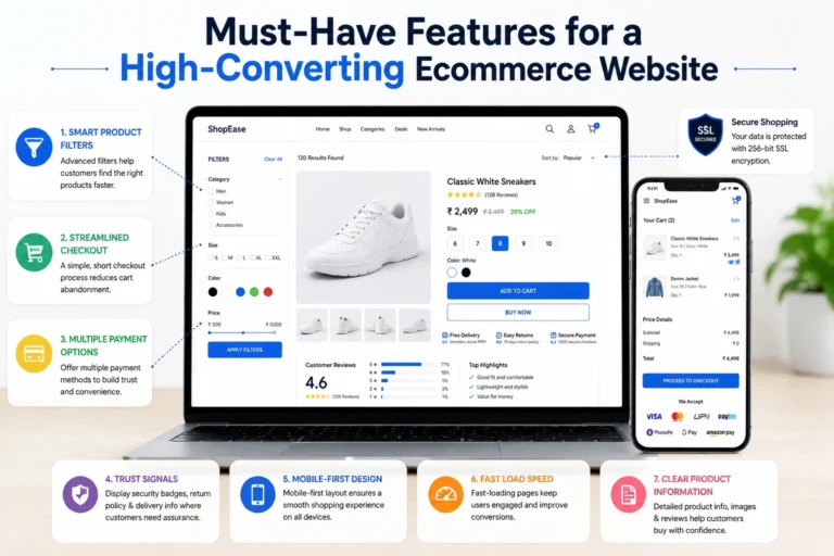
Product Filters That Match How People Shop
Generic filters (price, category) aren’t enough once your catalog grows past a few dozen items. Filters should reflect the specific decisions your buyers make — size, material, color, use-case, brand — and they need to update results instantly, without a full page reload. If a customer has to click “Apply” and wait, you’ve already lost some of them. Faceted search with live counts (showing how many products match each filter combination) keeps people exploring instead of bouncing when a filter returns zero results.
A common mistake here: adding filters for attributes that don’t actually drive purchase decisions, just because the data exists. Every filter option should answer a real question a shopper is asking.
A Checkout Flow With as Few Steps as Possible
Every additional screen in checkout is a chance to lose the sale. The features that consistently reduce cart abandonment:
- Guest checkout — forcing account creation before purchase is one of the single biggest drop-off points on ecommerce sites
- Progress indicators — showing “Step 2 of 3” reduces the anxiety of an open-ended process
- Auto-fill and address validation — cuts down on typing and failed deliveries
- Persistent cart summary — so the customer always sees what they’re paying for, with no surprise costs added at the final step
Hidden shipping costs revealed only at the last screen are a well-documented conversion killer — if shipping isn’t free, show the estimate early, ideally right on the product page.
Multiple Payment Gateways, Not Just One
Different customers trust and prefer different payment methods — cards, UPI, wallets, net banking, buy-now-pay-later options. A store that supports only one or two options is quietly turning away buyers who simply don’t want to use what’s offered. Payment gateway integration also needs to be fast (no visible lag when redirecting) and secure (PCI-DSS compliant processing, not custom-built card handling).
Trust Badges and Signals, Placed Where Doubt Happens
Trust badges only work when they appear at the exact moment a buyer is hesitating — not buried in the footer. That means:
- Security badges (SSL, payment gateway logos) near the payment form, not just the homepage
- Return/refund policy visible on the product page itself, not three clicks away
- Delivery timelines stated clearly before checkout, not discovered after payment
The goal isn’t decoration — it’s answering the unspoken question “is this safe?” right when the customer is asking it.
Mobile-First Layout, Not Mobile-Adapted
Most ecommerce traffic today comes from mobile, so the site needs to be designed for a thumb and a small screen first, then scaled up — not the reverse. That means tap targets sized for fingers, a sticky “Add to Cart” button that doesn’t disappear on scroll, and checkout forms that trigger the right mobile keyboard (numeric for phone/OTP fields, for example).
Fast Load Times on Every Page, Not Just the Homepage
Product listing and product detail pages are where load speed matters most, because that’s where the decision to buy or leave gets made. Compressed images, lazy loading below the fold, and a properly optimized backend all contribute — but this is a technical foundation, not a plugin you install once and forget.
Clear, Honest Product Information
High-converting product pages answer the buyer’s real questions upfront: sizing details, material specs, what’s included, and genuine customer photos or reviews where available. Vague descriptions push buyers to leave and compare on a competitor’s site instead.
Frequently Asked Questions
What's the single biggest feature that improves ecommerce conversion rates?
There isn’t one silver bullet — but checkout friction (forced account creation, hidden costs, too many steps) is consistently the largest single point of drop-off across ecommerce stores.
Do I need guest checkout if I want customer accounts for repeat business?
Yes — offer both. Let people check out as a guest, then prompt account creation after the purchase is complete, when there’s no friction cost to asking.
How many payment options should a store realistically offer?
Enough to cover your actual customer base — typically cards, UPI, and at least one wallet or BNPL option for markets where that’s common. More options help only if they match what your specific buyers actually use.
Do product filters slow down page load if I add too many?
They can, if implemented poorly. Filters should be built to query efficiently in the backend, not load the entire catalog client-side and filter in the browser.
Where should trust badges be placed for maximum effect?
Near the payment form and on product pages — not just the footer or homepage, where buyers rarely look while actively deciding.
Is mobile optimization really that different from having a "responsive" site?
Yes. Responsive means the layout doesn’t break on a small screen. Mobile-first means the interactions — tap targets, forms, navigation — are designed for mobile as the primary experience, not just resized.
How much does checkout abandonment typically improve with fewer steps?
It varies by store and industry, so we won’t quote a fixed number here — but reducing steps and removing forced signup are two of the most reliably effective changes across ecommerce businesses generally.
Should I build custom ecommerce features or use a platform's built-in ones?
Depends on your catalog size, growth plans, and how specific your needs are. A platform’s built-in filters and checkout may be enough early on; custom development makes sense once you need something the platform genuinely can’t do.
Do trust badges actually need to be "real" certifications, or just visual cues?
They need to be real. A fake or generic badge that isn’t backed by an actual security certification or policy can damage trust worse than having no badge at all.
What's the first feature to fix if my ecommerce site already exists but converts poorly?
Start with checkout — audit every step a buyer takes from cart to confirmation, and remove anything that isn’t strictly necessary. It’s usually the fastest fix with the most measurable impact.
If your store is missing several of these — or you’re not sure which ones are actually costing you sales — that’s exactly the kind of audit worth doing before adding more traffic to a leaky funnel. Get in touch to talk through what a high-converting ecommerce build looks like for your specific catalog and customers, or call 9718604362 directly.