Common Mistakes to Avoid When Building an Online Store
Most failed online stores don’t fail because of bad products. They fail because of avoidable technical and design mistakes made during ecommerce website development — the kind that quietly bleed customers before they ever reach the “Buy Now” button. If your store isn’t converting the way you expected, the problem is usually one (or several) of the issues below, not your marketing spend.
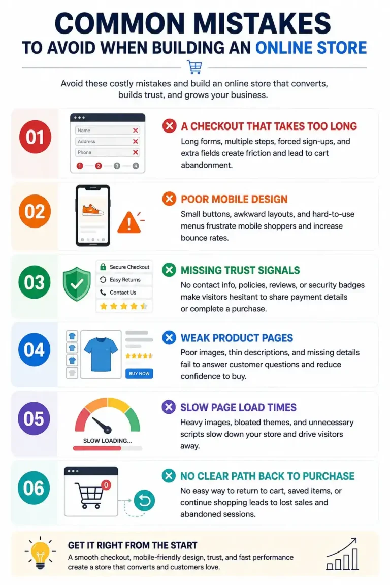
Mistake #1: A Checkout That Takes Too Long
Checkout is where money either gets made or lost. Every extra step, every unnecessary form field, every forced account creation is a chance for a buyer to close the tab.
What actually causes slow checkouts:
- Multi-page checkout flows when a single page (or a clean two-step process) would do
- Mandatory account sign-up before purchase, instead of a guest checkout option
- Asking for information you don’t need at that stage — like a full billing address before the customer has even confirmed shipping cost
- Payment gateways that redirect off-site and take several seconds to load
A checkout should feel like it’s moving forward with almost no thinking required. If a customer has to pause, reread a field, or wonder why you’re asking for something, that’s friction — and friction in ecommerce website development directly costs sales, not just satisfaction.
Mistake #2: Poor Mobile Design
A large share of online shopping now happens on a phone, yet a lot of stores are still built desktop-first and adapted to mobile as an afterthought. That shows up as:
- Buttons too small or too close together to tap accurately
- Product images that don’t resize properly, forcing awkward pinch-zooming
- Menus that are hard to navigate with a thumb
- Checkout forms where the keyboard covers half the screen
Mobile-first isn’t a buzzword — it’s a build order. Design and test the mobile experience first, then adapt it upward for desktop, not the other way around. Store owners who skip this step usually don’t notice the damage in analytics either; they just see a high mobile bounce rate and assume it’s a traffic quality issue, when it’s actually a design one.
Mistake #3: Missing Trust Signals
New visitors don’t know your brand yet, and online shopping already asks people to hand over card details to a website they’ve likely never bought from before. Without visible signals of legitimacy, hesitation kicks in at exactly the wrong moment — checkout.
Trust signals worth having on a store:
- Clear, visible contact information (not buried in a footer link three clicks deep)
- Return and refund policy stated plainly, not hidden in dense terms and conditions
- Secure payment badges near the payment step, where the doubt actually happens
- Real product photography instead of stretched stock images
If you don’t have testimonials or reviews yet, don’t fabricate them — that erodes trust faster than having none at all. Instead, lean on transparency: clear policies, real answers to real questions, and a store that looks maintained and cared for.
Mistake #4: Weak Product Pages
The product page is doing the job a salesperson would do in a physical store — and most ecommerce stores under-invest in it. Common weak spots:
- One or two low-quality images with no zoom or multiple angles
- Descriptions copied straight from a manufacturer spec sheet instead of written for the actual buyer
- No clear answer to obvious questions: sizing, material, what’s included, delivery timeline
- A “Buy Now” button that isn’t visually the most prominent thing on the page
A strong product page answers the buyer’s unspoken questions before they have to ask them. If someone has to open a support chat to find out basic details, that’s a page that isn’t finished yet.
Mistake #5: Slow Page Load Times
This one rarely gets flagged during design reviews because it’s invisible until you measure it. Heavy, uncompressed images, unnecessary third-party scripts, and bloated themes all add seconds to load time — and every extra second before a page becomes usable pushes visitors toward the back button
Mistake #6: No Clear Path Back to Purchase
Stores often make it easy to browse and hard to return. No visible cart icon while scrolling, no persistent “continue shopping” path, no simple way to get back to a saved item — these small navigation gaps add up to abandoned sessions that never come back.
Getting This Right From the Start
Every mistake above is fixable, but they’re far cheaper to avoid at the build stage than to patch after launch. That’s the core of solid ecommerce website development — checkout, mobile experience, trust, and product pages designed together as one system, not bolted on separately.
If your store is already live and one or more of these issues sound familiar, it’s worth an honest audit before spending more on ads to a leaky funnel.
FAQs
What's the single biggest mistake that hurts ecommerce conversions?
A slow or complicated checkout usually causes the most damage, since it loses customers at the final step, right after they’ve already decided to buy.
How do I know if my store has poor mobile design?
Try completing a full purchase on your own phone, on mobile data, without zooming in. If any step feels awkward or unclear, a customer will feel it too — and most won’t push through it.
Do I need reviews to build trust if I'm a new store?
No — real reviews take time to accumulate. In the meantime, clear policies, visible contact details, and honest product information do more for trust than fake or vague reviews ever could.
How many product images should a product page have?
Enough to answer visual questions a buyer would ask in person — multiple angles, scale reference, and close-ups of texture or detail where relevant. There’s no fixed number; it depends on the product.
Is guest checkout really necessary?
Yes. Forcing account creation before purchase is one of the most common reasons carts get abandoned. You can still offer account creation after the order is placed.
Why does page speed matter if my design already looks good?
A good-looking page that loads slowly never gets seen by a large share of visitors, who leave before it finishes rendering. Speed is part of the design, not separate from it.
Should I build on a website builder or invest in custom ecommerce development?
It depends on your scale and growth plans — builders work for simple stores, but custom development gives more control over checkout flow, page speed, and design once you outgrow templates
What's a quick way to check if my checkout has too much friction?
Count the number of clicks and form fields from cart to order confirmation. If it’s more than a handful, look for steps that can be combined or removed.
Are trust badges necessary if I use a well-known payment gateway?
They still help. Even with a recognizable gateway, visible security cues near the payment step reduce last-second hesitation, especially for first-time buyers.
How often should an ecommerce store be reviewed for these mistakes?
At least once every few months, and especially after any major traffic increase — issues that were minor at low volume can become real revenue leaks at scale.