Dark Mode Website Design: Is It Actually Worth Building for Your Audience?
Dark Mode Website Design: Is It Actually Worth Building for Your Audience? Dark mode is worth building when your visitors...
Read More → Micro-interactions in UI design are the small, single-purpose responses an interface gives to an action: a button that depresses when tapped, a heart that fills when you like a post, a form field that shakes when the input is wrong. They matter because they answer the question every user silently asks after clicking something: “Did that work?” When the answer is instant and clear, people continue. When it’s missing, they hesitate, click twice, or leave.
If you’ve ever tapped “Pay Now” and wondered whether it went through, you’ve felt a micro-interaction that wasn’t designed. Here’s how to design the ones that are.
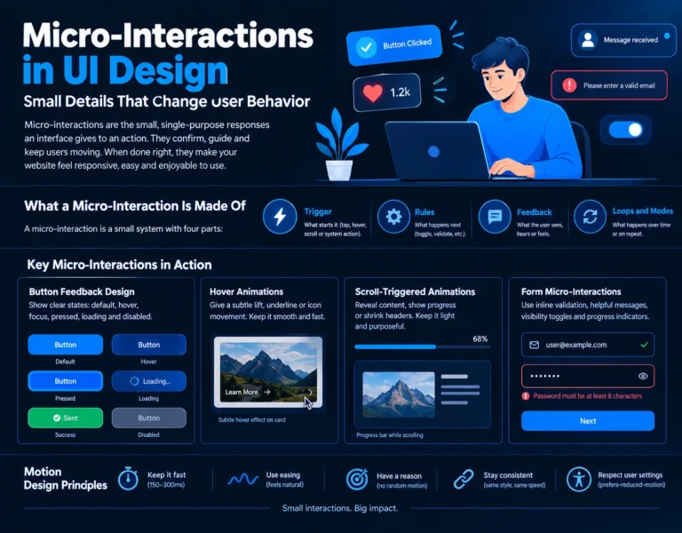
A micro-interaction is a small system with four parts, a model popularised by designer Dan Saffer:
When a micro-interaction feels broken, one of these four is usually missing. A “Save” button with a trigger and rules but no feedback is the classic case.
Interface feedback is about perceived responsiveness. A page can be technically fast and still feel dead if nothing acknowledges the user’s input. Jakob Nielsen’s well-known response-time guidelines put roughly 0.1 seconds as the point where a response feels instantaneous, and about 1 second as the limit before users notice the delay and their flow of thought is interrupted. A micro-interaction can bridge the gap: a button that reacts within a fraction of a second tells the user the system heard them, even if the actual work takes longer.
Beyond speed perception, micro-interactions do three practical jobs:
If you only polish one thing, polish buttons. Every conversion path ends in one.
A complete button needs distinct states: default, hover, focus, pressed, loading, and disabled. Many sites ship only the first and a faint version of the second. A few specifics that make a real difference:
Hover effects are useful when they communicate “this is clickable” or preview what will happen. A card that lifts slightly, a link whose underline slides in, an icon that nudges toward the arrow direction: all of these set expectations before the click.
They go wrong in three ways. They’re too slow (anything that makes the user wait for an animation to finish before acting is a tax), too dramatic (a card that jumps 20 pixels makes surrounding content feel unstable), or too inconsistent (every button reacting differently). Remember also that touch devices have no hover. Anything essential communicated only through hover will simply never be seen on a phone, so use hover as an enhancement and make sure the tap state carries the same meaning.
Scroll-triggered animations work best when they reveal structure: a progress bar showing how far through an article you are, a sticky header that shrinks to save space, a section that fades in as it enters the viewport so the eye knows where to land.
The risk is performance and patience. Heavy scroll effects can cause jank on mid-range phones, and long entrance animations make people scroll past content before it has finished appearing. Keep entrance animations short, animate cheap properties (opacity and transform rather than layout-shifting ones), and never hide key content, like pricing or a contact form, behind an animation that might not fire. If you’re also working on page speed, this ties directly into the kind of load-time and redesign decisions covered in our wider UI/UX design services guidance.
Forms are where users abandon, so small feedback pays off here more than anywhere else:
Good motion design in interfaces follows a few simple rules:
Feedback has to stay visible when the colour scheme changes. A subtle glow that works on a white background can vanish on a dark one, and a shadow-based hover lift often needs a different treatment entirely. If you’re offering both themes, test each micro-interaction in each one. We go deeper on this in our guide to dark mode design.
You don’t need to animate your whole site. Start by walking your main conversion path, from landing page to enquiry or checkout, and note every moment where a user acts and nothing visibly happens. Fix those first: buttons, forms, navigation, loading states. Then move on to the finishing touches. This is the difference between polish that supports the interface and decoration layered on top of it.
They’re small, focused moments of feedback tied to a single action, such as a button changing state on click, a toggle sliding, or a field validating input. Each one confirms the system received the user’s action.
They can influence behavior at critical moments, for example by confirming a form submission or preventing a double click on a payment button. The effect depends on the page and audience, so test changes rather than assuming a number.
An animation is movement. A micro-interaction is movement (or sound, or haptics) with a job: it responds to a trigger and gives feedback. Decorative motion that responds to nothing isn’t a micro-interaction.
Button states, form validation, and loading indicators on your main conversion path. These solve real confusion; hover flourishes can come later.
Yes, if they’re heavy. Animate opacity and transform where possible, avoid animating layout properties, keep libraries light, and test on a mid-range phone rather than only on your own device.
Roughly 150–300 milliseconds suits most interface transitions. Larger movements, like a full-screen panel, can take a little longer, but if users notice they’re waiting, it’s too slow.
Not directly, because touch screens don’t have hover. Design the pressed and tapped states properly, and treat hover as a desktop-only enhancement.
Provide visible focus states for keyboard users, don’t rely on colour alone, avoid flashing effects, and honor the prefers-reduced-motion setting so people sensitive to motion can opt out.
Simple ones, like hover transitions and button states, are done in CSS. More complex ones, like scroll-linked effects or state-driven feedback, need JavaScript and close coordination between design and development.
When they compete for attention or slow the user down. A good test: remove one, and if nobody would notice what it did, it wasn’t helping.
If your site’s buttons, forms, and key pages feel flat or leave visitors unsure whether their action worked, I can help you design and build the interaction details that fix it. I’m Sanjeev Kumar Malik, and I work on website development and UI/UX for businesses.
👉 Explore my website development services or call/WhatsApp 9718604362 to talk through your site.