Dark Mode Website Design: Is It Actually Worth Building for Your Audience?
Dark Mode Website Design: Is It Actually Worth Building for Your Audience? Dark mode is worth building when your visitors...
Read More → Web accessibility WCAG compliance means your website can be used by people with visual, hearing, motor, and cognitive disabilities, and that it meets the success criteria in the Web Content Accessibility Guidelines (WCAG), the international standard published by the W3C. For most business websites, the practical target is WCAG 2.2 Level AA.
That’s the short version. The longer one is more useful, because “WCAG compliant” gets thrown around as a badge when it’s really a set of testable checks, and most sites fail a handful of them for the same boring reasons.
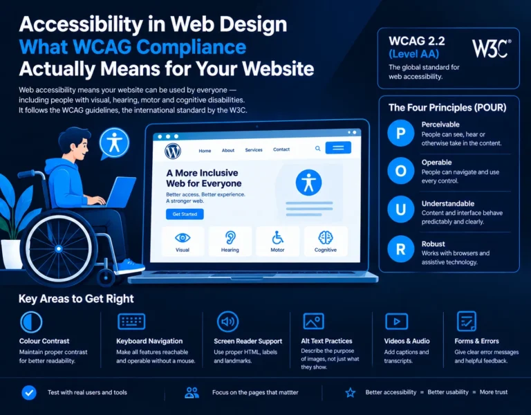
WCAG is not a law, a plugin, or a certificate you buy. It’s a list of success criteria organised under four principles, usually shortened to POUR:
Each criterion has a level: A (the baseline), AA (what most laws and clients ask for), and AAA (the strictest; rarely applied to a whole site). When someone says their site is “WCAG compliant,” ask which version and which level. Without those two details, the claim means almost nothing.
The ADA is a US law, so there’s no “ADA-certified” status for an Indian website. If you search for an ADA compliant website in India, what you usually want is one of two things.
First, if you serve US customers, US accessibility lawsuits can reach foreign businesses, and WCAG AA is the yardstick those cases use. Second, within India, the Rights of Persons with Disabilities Act, 2016 pushes towards accessible digital services, and government websites follow the GIGW guidelines, which are themselves built on WCAG. Requirements differ by sector and client, so if you have a legal exposure question, take it to a lawyer. From a design standpoint, building to WCAG 2.2 AA covers you in nearly every case.
Normal body text needs a contrast ratio of at least 4.5:1 against its background. Large text (roughly 24px regular or 19px bold and up) needs 3:1, and so do meaningful UI elements like input borders and icons. The usual offenders are light grey text on white, white text on pastel buttons, and placeholder text that’s nearly invisible. Also check text over hero images, because contrast changes across the photo, and don’t use colour alone to signal something. A red border on an error field means nothing to a colour-blind user unless there’s also a message.
Unplug your mouse and try to use your own site with Tab, Shift+Tab, Enter, Space, and the arrow keys. You’ll learn quickly. Every link, button, form field, and menu must be reachable and operable, and you must always be able to see where focus is. Removing the focus outline with outline: none and not replacing it is the single most common keyboard failure I’d expect to find on a site. Watch for these traps:
WCAG 2.2 also added a minimum target size of 24×24 CSS pixels for pointer targets, which helps anyone with tremors or large fingers on a phone.
Screen readers like NVDA, JAWS, VoiceOver, and TalkBack don’t see your design. They read the code structure. So compatibility mostly comes from using HTML properly:
If you want a quick sanity check, turn on VoiceOver or NVDA and listen to your homepage with your eyes closed. If you can’t tell what the page is for after ten seconds, a blind visitor can’t either.
Alt text should describe what the image does on the page, not just what it shows. A product photo gets a short description of the product. A logo that links home gets “Company name, home.” A purely decorative flourish gets an empty alt=”” so screen readers skip it. Charts and infographics need the key takeaway in text nearby, not “graph.” Avoid starting with “image of,” and don’t stuff keywords in. Alt text written for SEO instead of people helps neither.
Videos need captions, and audio needs a transcript. Forms need clear error messages that say what went wrong and how to fix it. Text should resize to 200% without breaking the layout. PDFs you publish should be tagged and readable, not scanned images. And WCAG 2.2 added criteria such as visible focus not being hidden behind sticky headers, and not forcing users to re-enter information they’ve already given.
Automated tools like Lighthouse, axe DevTools, and WAVE catch some issues quickly, but they find only a portion of real problems. They can tell you an image has alt text, not whether the alt text is any good. Combine them with a keyboard test, a screen reader pass on your main journeys (home, key service page, contact or checkout), a zoom test, and a contrast check. Fix issues on the pages that matter commercially first.
Accessibility also overlaps heavily with usability. Clear labels, strong contrast, and predictable navigation help everyone, including people on a phone in bright sunlight. That’s the same thinking behind designing for trust (link to Blog 3), since a site that’s easy and predictable to use feels more credible. It also fits within the larger picture of UI/UX design services (link to pillar), where accessibility is a design requirement from the first wireframe, not a late patch.
Web Content Accessibility Guidelines. They’re published by the W3C and are the most widely referenced standard for accessible websites.
WCAG 2.2 Level AA is the sensible target for most business sites. Level A alone leaves major gaps, and AAA isn’t realistic across an entire site.
There’s no single law that says “your website must meet WCAG AA.” However, the RPwD Act, 2016 supports digital accessibility, and Indian government sites follow GIGW, which is based on WCAG. Many clients and tenders also ask for it. Check specifics with a legal professional.
ADA is a US law. It becomes relevant mainly if you serve or sell to US customers. Courts there typically look to WCAG 2.x AA, so meeting that standard is the practical way to reduce risk.
4.5:1 for normal text, 3:1 for large text, and 3:1 for UI components and graphical objects that carry meaning.
Not on its own. Overlays can fix a few surface issues, but they can’t repair poor structure, missing labels, or broken keyboard flows. Real compliance comes from fixing the underlying design and code.
Use NVDA (free, Windows), VoiceOver (built into Mac and iPhone), or TalkBack (Android). Navigate by headings, links, and form fields, and see whether each makes sense out of context.
No. Contrast, spacing, and clear hierarchy can be done within almost any brand palette; it may just need a slightly deeper shade of a colour. Accessible sites often convert better because they’re clearer.
They overlap in practice: proper headings, descriptive alt text, clean semantic HTML, and fast, usable pages help both users and search engines. It isn’t a ranking shortcut, but the good habits are shared.
After any redesign or major feature, and as a routine check a couple of times a year. New content, plugins, and third-party widgets can introduce fresh issues without anyone noticing.
If you’re not sure where your site stands on WCAG, I can review your key pages and tell you what to fix first. Visit Sanjeev Kumar Malik’s website development services to see how I work, or call 9718604362 to talk through your site.