Dark Mode Website Design: Is It Actually Worth Building for Your Audience?
Dark Mode Website Design: Is It Actually Worth Building for Your Audience? Dark mode is worth building when your visitors...
Read More → Visitors buy from your website when it answers one silent question fast: “Is it safe to give this business my money and my details?” Good UX design for trust conversions means placing proof, security cues and clear pricing exactly where doubt shows up. That includes next to the price, beside the payment fields and inside the checkout flow, not just in a footer or on an “About” page.
Think of a visitor who has already decided they like your product. They add it to the cart, reach the payment step, and hesitate. Nothing is wrong with the design. But the page doesn’t tell them what happens after they pay, whether the card details are protected, or if there’s a charge they haven’t seen yet. That hesitation is where most trust problems sit. This post walks through the patterns that remove it.
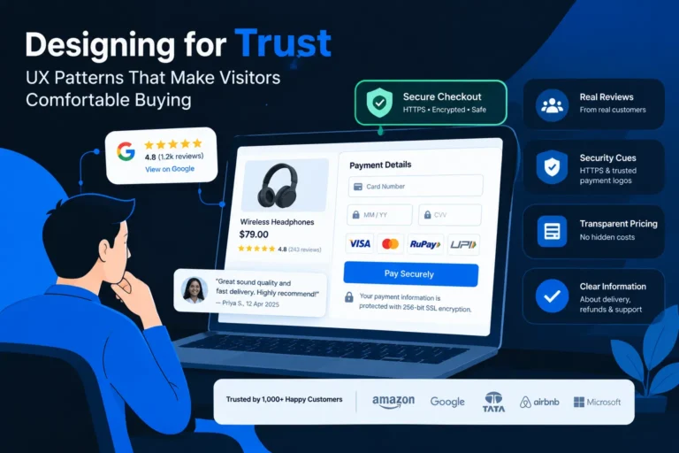
Trust signals in web design are the visible cues that tell a visitor your business is real, competent and safe to deal with. They fall into four groups:
The last group is easy to overlook. A page with misaligned buttons, a slow load or a confusing menu makes people doubt the business behind it, even when every badge is in place. Credibility design elements work as a system. One strong badge can’t make up for a sloppy page.
Most sites collect reviews and then dump them on a single “Testimonials” page that few people open. Social proof placement matters more than social proof volume.
Specific beats glowing. “Great service!” tells a visitor nothing. “They rebuilt our checkout and we stopped getting ‘where is my order’ calls” tells them something. Use only real reviews from real customers, with a name or business and a date where possible. If you don’t have any yet, don’t invent them. Start collecting through a post-delivery email and display what comes back.
Review integration done well means pulling genuine reviews from a source people recognise, such as Google Business Profile or a marketplace, and showing them in context.
A few practical points:
Security badges reassure people only if they’re real and placed near a decision. A row of unrecognisable icons in the footer does little. A recognised payment-gateway logo beside the card fields does a lot.
Hidden costs are the most common reason people leave at checkout. Transparent pricing display doesn’t mean publishing every number, but it does mean no surprises.
A visitor who knows the full cost before committing feels in control. That feeling is trust.
Beyond badges and reviews, ordinary usability choices make visitors comfortable. Several of these overlap with the points in our guide on accessibility and WCAG compliance, because a site that’s easy for everyone to use also feels more dependable.
These patterns are part of the broader practice covered under our UI/UX design services, where the layout, flow and content are planned together instead of patched one section at a time.
Open your own site on a phone and walk through it as a first-time buyer. Ask yourself:
Every “no” is a place where a hesitant visitor might leave.
It’s the practice of designing a website so that visitors feel safe and informed enough to buy or enquire. It combines proof, transparency, security cues and clear layout, placed at the points where doubt is highest.
Real reviews, clear pricing, visible contact details and secure checkout cues usually matter most. Which one is the priority depends on your business: a service company leans on case studies and reviews, while an online store needs security and refund clarity.
Next to the main call-to-action, near the price and close to the checkout or enquiry form. A separate testimonials page is fine as a bonus, but it shouldn’t be the only place proof appears.
They help when they’re recognisable, genuine and placed next to a payment or form step. Generic or unverifiable badges in the footer add little. Never show a badge you haven’t earned.
Explain what drives the cost, give a “starting from” figure or typical range if you’re comfortable doing so, and describe how the quoting process works. Clarity about the process builds trust even without a fixed price.
Yes. Too many icons clutter the page, slow it down and can look defensive. Pick a few that are relevant to the step the visitor is on.
A few critical reviews with polite, helpful replies make the rest more believable. Hiding every negative one can make the whole set look filtered.
Slow or jumpy pages make a business look unreliable, so visitors hesitate before sharing details or paying. Speed is part of credibility, not just a technical metric.
Yes. Readable text, clear labels, keyboard-friendly forms and good contrast make a site easier for everyone to use, and ease of use feels dependable. It also widens the group of people who can complete a purchase.
Watch where visitors drop off: product page, cart, payment or form. Then match the drop-off to its likely doubt (price, security, proof or confusion) and fix that step first. Session recordings and a simple walkthrough on mobile often reveal the issue quickly.
If your traffic is fine but enquiries or checkouts aren’t following, the gap is often trust, not design taste. I’m Sanjeev Kumar Malik, and I help businesses build websites where proof, pricing and security cues sit exactly where visitors need them. Take a look at my website development services or call me on 9718604362 to talk through what’s holding your site back.