Dark Mode Website Design: Is It Actually Worth Building for Your Audience?
Dark Mode Website Design: Is It Actually Worth Building for Your Audience? Dark mode is worth building when your visitors...
Read More → Dark mode is worth building when your visitors use your site in low light, spend long sessions on it, or already expect it (developer tools, media, finance dashboards, night-time browsing). It is not worth building if you’d ship it half-finished. A sloppy dark theme with muddy contrast does more harm than having no dark theme at all.
That’s the real question behind dark mode website design: not “should we have it?” but “can we do it properly, and will our audience notice?”
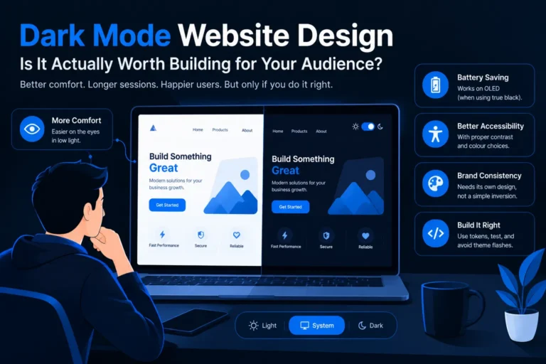
Dark mode isn’t a universal upgrade. It pays off for specific situations:
It matters less for a five-page brochure site where most visitors read one page and leave. There, the same hours are usually better spent on speed, copy, and the main conversion path.
You’ll see “reduces eye strain” claimed everywhere. The honest version is more nuanced.
Dark mode helps in dim environments because less light is blasted at your eyes. In bright rooms, light text on a dark background can be harder to read, and some people with astigmatism find it blurry because the pupil opens wider in dark interfaces and light text seems to bleed at the edges (called halation).
So don’t sell dark mode as a health feature. Treat it as a comfort option, and give people the choice.
On OLED and AMOLED screens, each pixel makes its own light, so a black pixel is switched off. A dark interface can use less power than a bright one on those phones.
Two conditions apply:
That’s a nice perk to mention, but not a reason to ship dark mode by itself.
Dark mode and accessibility go together only if you test them. Dark theme accessibility isn’t automatic; the WCAG contrast targets are the same as for light mode: at least 4.5:1 for normal text, 3:1 for large text and UI components like input borders and icons.
The common failures:
Run your actual colour pairs through a contrast checker. Don’t eyeball it, because screens differ and eyes adapt.
This is the part teams underestimate. A dark mode isn’t a colour inversion; it’s a second design of the same brand.
Interaction details matter too. Hover effects, button feedback and transitions can read very differently on a dark canvas, which is covered in our guide to micro-interactions in UI design (link to Blog 2, add URL).
This sits inside the wider discipline covered on our UI/UX Design Services page ([confirm pillar URL]), where theme decisions are one part of usability, hierarchy and conversion design.
Build dark mode if your audience skews toward night use, long sessions or tech-comfortable users, and if you have the budget to test it properly. Skip it, or postpone it, if your site is small, your traffic is mostly daytime desktop, and your current light design still has basic contrast or speed problems to fix first.
Not universally. It’s more comfortable in low light, but in bright environments or for people with astigmatism, light text on dark can be harder to read. That’s why a toggle matters.
No. The saving applies to OLED/AMOLED screens, and mostly with true-black or very dark pixels. LCD screens see no meaningful difference.
It’s better for some users (light sensitivity) and worse for others (astigmatism, some reading difficulties). Accessibility depends on meeting contrast ratios in both themes, not on the theme itself.
The same WCAG targets as light mode: 4.5:1 for regular text and 3:1 for large text and interface components like icons and input borders.
Usually not. Very dark grey is easier on the eyes, shows depth better through lighter surface layers, and avoids harsh smearing when scrolling on some OLED screens. True black can still suit media-heavy or OLED-focused designs.
No. Straight inversion breaks brand colours, images, shadows and contrast. Dark mode needs its own deliberately chosen palette.
Both. Follow the visitor’s system preference by default, and add a visible toggle with a System/Light/Dark choice that remembers their selection.
Logos and graphics designed for white backgrounds can disappear or look boxed in. Prepare alternate or transparent versions for the dark theme.
Not directly. Search engines don’t rank a site for having a dark theme. Indirectly, better comfort and engagement can help, but a broken dark theme with poor contrast or layout glitches can hurt the experience.
It depends on how the site is built. With design tokens and CSS variables from the start it’s modest; on a site with hard-coded colours everywhere, it’s closer to a partial redesign. A quick audit tells you which one you have.
If you’re deciding whether dark mode fits your audience, or you want it built properly with tested contrast, matching brand assets and no theme flicker, I can review your current site and tell you honestly if it’s worth it.
Talk to Sanjeev Kumar Malik: Explore website development services or call 9718604362.