Dark Mode Website Design: Is It Actually Worth Building for Your Audience?
Dark Mode Website Design: Is It Actually Worth Building for Your Audience? Dark mode is worth building when your visitors...
Read More → If most of your visitors are opening your site on a phone, but you designed it while staring at a 24-inch monitor, you may have built it backwards. Mobile-first design means creating the phone experience first instead of treating mobile as a smaller version of the desktop website. The layout, content, navigation, buttons, images, and interactions are planned for smaller screens before expanding the design for tablets and desktops.
In 2026, a mobile-first website design is important for user experience, website speed, accessibility, and search performance. A well-planned mobile experience helps visitors find information quickly, interact with your website easily, and take action without unnecessary friction.
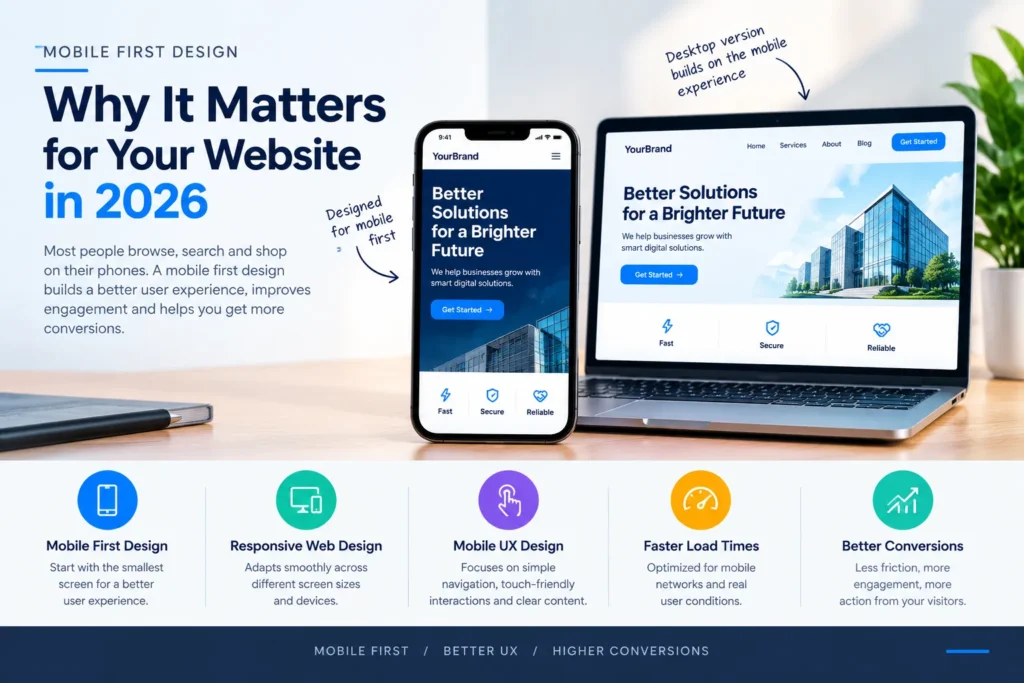
Mobile first designis a way of thinking, not just a checkbox in your dev tools. It means:
The opposite approach — “desktop first, then squeeze it down” — usually produces sites where mobile users get a cramped, reordered version of a design that was never meant to shrink. Buttons end up too small. Menus get buried three taps deep. Text wraps awkwardly because it was never tested at that width.
A few years ago, “mobile-friendly” meant your site simply didn’t break on a phone. That bar is far too low now. Search engines evaluate the mobile version of your site as the primary version — not a secondary one — when deciding how to rank you. If your mobile experience is clunky, that’s the experience being judged, full stop.
Beyond rankings, think about actual behavior. Someone searching for a plumber, a product, or a service on their phone isn’t going to zoom in, pinch around, and hunt for your contact number. They’ll hit the back button and try the next result. A mobile-first site removes that friction before it costs you the visitor.
A common mistake is designing for exactly three sizes — phone, tablet, desktop — and hoping everything in between just works out. It usually doesn’t. Responsive breakpoints should reflect where your actual content starts to break, not arbitrary device widths.
A few practical habits that hold up well:
Responsive design isn’t about making one layout technically fit every screen. It’s about the layout making sense at every screen.
Mouse cursors are precise. Fingers are not. This is the part of mobile UX best practices that gets skipped most often, and it shows up in small but frustrating ways:
None of these are complicated fixes individually. But add them up across a site, and you get an experience that feels like it was never actually tested on a real phone — because often, it wasn’t.
For most businesses today, mobile isn’t “a growing share” of traffic — it’s the majority, sometimes the overwhelming majority, depending on the industry. Once mobile is where most of your first impressions happen, it stops being reasonable to treat it as the secondary design target. Actual traffic numbers vary by business and industry, so the smart move is checking your own analytics rather than assuming — but for nearly every website we look at, mobile is where the decision to stay or leave gets made.
If your current site was built desktop-first, a proper mobile-first pass usually touches more than just spacing:
This isn’t a cosmetic refresh. Done properly, it changes how the site is structured, not just how it looks.
No — it means the phone experience is designed first as the foundation, then expanded and enhanced for larger screens. The desktop version can still be rich and detailed; it just isn’t the starting point anymore.
Not quite. Responsive design means the layout adapts across screen sizes. Mobile-first is a design philosophy about which size you design for first. A site can technically be responsive and still feel like an afterthought on mobile if it was designed desktop-first and then adapted down.
Try completing your site’s main action — booking, buying, filling a form, calling — using only one thumb on an actual phone, on a normal mobile connection. If it’s frustrating for you, it’s frustrating for visitors.
Tap targets that are too small or placed too close together, usually inherited from a design that was built for a mouse and never re-checked for touch.
Yes, directly. Designing mobile-first forces decisions about image sizes, fonts, and page weight early on, rather than trying to trim an already-heavy desktop design down afterward.
Every page a visitor might land on directly — which, in practice, is most of them. Landing pages, service pages, and contact/booking pages matter just as much as the homepage, often more.
It depends on how the current site was built. Some sites can be restructured incrementally — starting with navigation and forms. Others, especially older or heavily customized ones, are faster to rebuild than to retrofit.
Not inherently — it’s a different design process, not necessarily a more expensive one. The cost difference usually comes from the scope of the redesign, not the mobile-first approach itself.
Beyond just phone and tablet presets, test the widths where your own layout visibly starts to shift or break — this is specific to your design, not a universal list
This depends heavily on the size of the site and how much content needs restructuring versus how much can carry over as-is — a single landing page and a full multi-page site are very different scopes.
If your site still feels like it was built for a desktop screen and squeezed down for phones, that’s usually visible within seconds of loading it on mobile. A proper mobile-first redesign fixes that at the structural level — not just the styling. Get in touch with Sanjeev Kumar Malik to talk through what a mobile-first rebuild would actually look like for your site: 9718604362, or check out the Website Development Services page for more on how these projects are approached.