Dark Mode Website Design: Is It Actually Worth Building for Your Audience?
Dark Mode Website Design: Is It Actually Worth Building for Your Audience? Dark mode is worth building when your visitors...
Read More → Most landing pages fail for the same reason: they ask visitors to think instead of act. A landing page converts when it removes every unnecessary decision between “I’m interested” and “I’ve taken the action.” That’s it — no magic formula, no trick. Just clarity, focus, and trust, stacked in the right order.
If you’re evaluating landing page design services for your business, or trying to fix a page that gets traffic but no conversions, the principles below are the ones that actually move the needle — not the generic “use bold colors” advice you’ve probably already read.
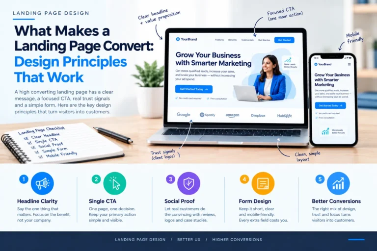
Visitorsdecide whether to stay on your page in under five seconds. Your headline carries almost all of that weight, and it has exactly one job: tell the visitor what they get and why it matters to them, right now.
A weak headline describes the company. A strong headline describes the outcome. Compare:
The second version tells a visitor exactly what problem gets solved. It doesn’t need a subheadline to explain itself, though a short supporting line under it can add specificity — who it’s for, or how fast results show up.
A common mistake here: trying to fit three benefits into one headline. That dilutes the message instead of strengthening it. Pick the single strongest reason someone would care, lead with it, and save the rest for the body.
This is the principle most businesses get wrong, usually with good intentions. They want visitors to call, fill a form, download a brochure, and follow them on Instagram — all from the same page. Every extra option is a chance for the visitor to do nothing at all, because choosing between five actions is harder than choosing between one.
A high converting landing page has exactly one primary action. Everything on the page — copy, layout, visual hierarchy — should point toward that single next step. If you genuinely need a secondary option (say, “Call now” alongside “Request a quote”), keep it visually secondary: smaller, less contrast, placed after the primary CTA has had its moment.
Repeat the primary CTA at natural pauses in the page — after the headline section, after you’ve built the case, and again at the end — rather than relying on one button the visitor has to scroll back up to find.
People trust other people’s experience more than they trust a company’s claims about itself. That’s why social proof — reviews, client logos, case studies, before/after examples — consistently lifts conversion rates when it’s used well.
The mistake most pages make isn’t the absence of social proof; it’s placing it badly or making it vague. “Trusted by thousands” without any specifics reads as filler. Effective social proof is specific: a named outcome, a recognizable logo, a real number tied to a real result. If you don’t have strong testimonials yet, don’t manufacture them — lean instead on transparent process detail, clear guarantees you can actually stand behind, or visible credentials. Specific and honest will always outperform vague and impressive-sounding.
Placement matters too. Put proof near the decision point — right before or after your CTA — not buried at the bottom where only the most motivated visitors will scroll to see it.
Forms are where good landing pages quietly lose people. Each additional field is one more reason to abandon. Before adding a field, ask whether you genuinely need that information to make the first contact — you can always collect more later in the sales process.
A few things that consistently help:
Mobile matters here more than anywhere else on the page — a form that’s easy to fill on desktop but fiddly on a phone will quietly bleed conversions, since most landing page traffic today arrives from mobile.
None of these principles work in isolation — they reinforce each other. A clear headline earns attention. A single CTA gives that attention somewhere to go. Social proof removes the hesitation right before the click. A short, well-designed form makes sure the click actually completes.
The pages that convert well aren’t the ones with the most features or the flashiest design — they’re the ones where every element earns its place, and nothing distracts from the one action you want the visitor to take.
If your current landing page checks some of these boxes but not others, that’s usually the fastest place to start — you don’t need a full rebuild, just a focused fix on whichever principle is weakest.
Long enough to answer the visitor’s objections, short enough that nothing feels like padding. Simple offers with low commitment (a free download, a quick call) often work fine short. Higher-commitment offers (a service contract, a larger purchase) usually need more context and proof before someone converts.
Generally no, or very minimal. Navigation gives visitors an exit before they’ve converted. Landing pages built for a specific campaign typically strip navigation down to just the logo, keeping focus entirely on the CTA.
This varies heavily by industry and offer type, so there’s no single universal benchmark. What matters more than hitting an industry average is tracking your own page’s baseline and testing changes against it over time.
Yes — a slow-loading landing page loses visitors before they even see your headline, especially on mobile connections. Speed is often the first thing worth checking before touching copy or design.
Video can work well when it demonstrates something hard to explain in text — a product in use, a process, a before/after. It shouldn’t replace your core copy or CTA, and it should never autoplay with sound, which tends to push visitors away rather than engage them.
It’s not mandatory to launch, but it’s the most reliable way to know which headline, CTA, or layout actually performs better for your specific audience, rather than guessing based on general best practices.
It can, but it performs best when the messaging matches the visitor’s context. A page built for a Google Ads visitor searching a specific term should feel different from one linked in a general social post — matching intent to messaging is part of what makes a page convert.
If your current landing page isn’t converting the way it should — or you’re starting from scratch — we design pages around exactly these principles: clear headlines, one focused CTA, real trust signals, and forms that don’t get in the way. Explore our Landing Page Design & Development services, or call 9718604362 to talk through what’s holding your page back.