Dark Mode Website Design: Is It Actually Worth Building for Your Audience?
Dark Mode Website Design: Is It Actually Worth Building for Your Audience? Dark mode is worth building when your visitors...
Read More → “Landing page mistakes can quietly reduce conversions even when your ads are bringing the right visitors. Cluttered design, weak headlines, missing trust signals, and slow loading can make it harder for visitors to understand the offer and take action.”
If you’re working with a landing page design services provider or building one yourself, these are the issues that show up again and again — and what actually fixes them.
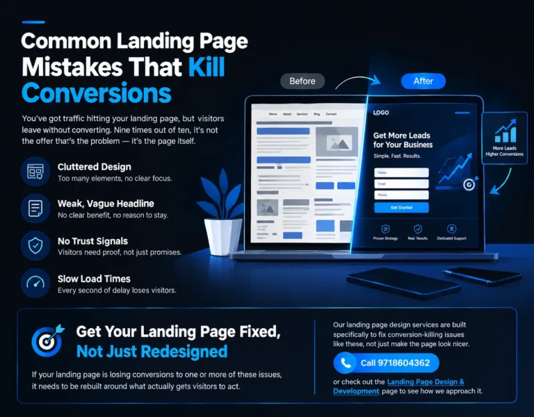
A landing page has one job: get the visitor to take one action. The moment you add three CTAs, a navigation bar linking to five other pages, a rotating banner, and a sidebar full of “related links,” you’ve turned a focused conversion tool into a mini-website with no clear direction.
Clutter isn’t just about visual mess — it’s about decision fatigue. Every extra element competing for attention is one more reason a visitor hesitates and eventually closes the tab instead of converting.
What actually works:
If a section doesn’t answer “why should I act now,” it’s clutter, no matter how good it looks.
The headline is read by 100% of visitors and often decides whether they read anything else. “Welcome to Our Company” or “The Best Solutions for Your Business” tells a visitor nothing and gives them zero reason to stay.
A weak headline usually fails in one of three ways: it’s too generic to differentiate the offer, it talks about the company instead of the visitor’s problem, or it buries the actual benefit under clever wording that needs decoding.
What a strong headline does instead:
Test this: if you removed your company name from the headline, would it still make sense and still be specific? If not, it’s doing branding’s job, not conversion’s job.
Visitors arriving from an ad or search result are, by default, skeptical. They don’t know your business yet, and a landing page with no proof of credibility asks them to take a leap of faith most people won’t take.
This doesn’t always mean a lack of testimonials — sometimes it’s a page that never explains who’s behind the offer, how the process works, or what happens after someone submits the form. Uncertainty at any stage of that journey is enough to stall a conversion.
Practical ways to build trust even without a big review library yet:
If you do have testimonials, certifications, or client logos, they belong near the CTA, not buried at the bottom of the page where most visitors never scroll.
This one kills conversions before the visitor even sees the design. A landing page that takes several seconds to load loses a meaningful chunk of traffic before the headline is even visible — and that’s before counting the visitors who do wait but arrive already irritated.
Slow load time is almost always caused by the same few culprits: oversized hero images, too many third-party scripts (chat widgets, multiple tracking pixels, unnecessary plugins), and unoptimized fonts or animations that add weight without adding conversion value.
What to check:
A one-second delay in load time is often the difference between a visitor who converts and one who bounces straight back to the search results.
None of these problems exist in isolation. A cluttered page with a weak headline gives visitors two reasons to leave before they even reach the form. Add a slow load time and no trust signals, and you’re not looking at a conversion rate problem anymore — you’re looking at a page that was never built to convert in the first place.
The fix isn’t a single redesign trick. It’s auditing the page against exactly these four points, one at a time, and being honest about which ones apply.
Look at it with fresh eyes (or ask someone unfamiliar with the page) and time how long it takes them to identify the one thing you want them to do. If it takes more than a few seconds, there’s too much competing for attention.
Not necessarily — clear process explanation and specific, honest detail about the offer can build trust even without a large review base. Testimonials help, but vague trust badges without real backing help less than genuine transparency does.
Under 2-3 seconds is the general benchmark before drop-off rates start climbing noticeably, especially on mobile connections.
It helps significantly, but it works best alongside the other fixes — a great headline on a cluttered, slow page still loses visitors before they act on it.
For high-intent, campaign-driven pages, no — removing the nav (including the logo link) keeps visitors from leaving before they convert. General informational pages on your main site are a different case.
Ideally one action, repeated in a few places on the page (top, middle, bottom) rather than multiple different actions competing for the same click.
This usually points to a mismatch between what the ad promised and what the page delivers, a weak or unclear headline, or friction in the form itself — too many fields, unclear next steps, or no reassurance about what happens after submission.
No — length isn’t the issue, relevance is. A longer page that answers real objections and builds toward the CTA can outperform a short page that leaves questions unanswered. Padding a page just to make it longer is what hurts conversions.
Focusing purely on visual polish — new colors, new images — without addressing the actual friction points: unclear headline, missing trust signals, or slow load time. A page can look better and still convert worse.
Any time ad spend, offer, or audience changes — and at minimum every few months even without changes, since load speed, broken links, and outdated trust signals degrade a page’s performance quietly over time.
If your landing page is losing conversions to one or more of these issues, a fresh coat of paint won’t solve it — it needs to be rebuilt around what actually gets visitors to act. Our landing page design services are built specifically to fix conversion-killing issues like these, not just make the page look nicer.
Call 9718604362 or check out the Landing Page Design & Development page to see how we approach it.